
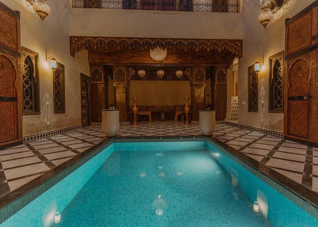
A convincing Morocco palette is usually quieter than the souvenir image in our imagination. Earth walls, pale dust, sun-bleached surfaces and deep architectural shadow create the foundation. Cobalt, turquoise, green and red become powerful because they are used selectively.
Build a compact working palette
You do not need exact brands or an enormous colour box. Think in roles:
- a transparent warm yellow;
- a warm earth colour;
- a deeper brown or neutral earth;
- a warm red;
- a cool blue;
- a warmer blue; and
- an optional green or turquoise accent.
Test the pigments you already own. Lightfastness, transparency and staining behaviour matter more than a fashionable colour name.
Mix the walls rather than reaching for pink
Begin with a warm earth mixture and adjust it with a small amount of red, yellow or blue. Let paper white contribute to sunlit areas. For a cooler wall in shade, introduce blue into the existing earth mixture rather than switching to an unrelated grey. This keeps light and shadow within the same colour family.
Separate local colour from light
A blue door is not one blue. Sunlit paint, worn edges and reflected warm walls can produce several temperatures within it. Mix the surrounding environment into the object colour. That creates belonging and avoids cut-out shapes.
Use neutrals made from the palette
Mixed neutrals are more flexible than a single black. Combine complementary tendencies—a warm earth with blue, or red with green—and move the mixture warmer or cooler as required. Reserve the darkest darks for places that need structure: an opening, the underside of an awning or a small focal accent.
Foliage is rarely tube green
Palms and garden foliage contain sunlit yellow-green, cooler interior shapes and dry brown edges. Mix greens from the same yellow and blues used elsewhere in the painting, then neutralise them with earth colour. This connects foliage to architecture.
A six-swatch exercise
- Warm wall in sunlight.
- The same wall in shade.
- Cool reflected light.
- Muted foliage.
- Deep architectural neutral.
- One saturated accent.
Place the swatches beside each other. If the accent dominates before it belongs to a subject, reduce its saturation or area.
Keep watercolour luminous
Plan the lightest shapes, use clean water and avoid repeatedly stirring a wash on the paper. Let some mixtures separate naturally. A limited first wash can establish atmosphere; later marks should clarify structure rather than cover every surface.
Make colour notes from life
Photographs can change warmth, contrast and saturation. Add labelled swatches to a sketchbook while observing: “pink wall, reflected green”, “cool tile in warm shade”. Those notes are valuable when developing a later painting.
Use this palette with the exercises in our Morocco sketchbook guide. Jurga explores colour, texture and atmosphere during the current Marrakech watercolour retreat.